
Article Summary
- Colour is one of the cheapest levers you can pull to make a boring category feel new. You are not reinventing the product, you are giving a new buyer a reason to care.
- Stanley, Le Creuset, KitchenAid and Our Place all sell products that already existed in some form. Colour is a big part of what turned them into things people collect, gift and post about.
- Most home and garden categories are still stuck in a sea of black, silver, wood and "forest green". That is the gap.
- Salt and pepper mills, watering cans, hand tools, kitchen canisters, BBQ tools and planters are prime candidates for a colour-led range.
- Start small: one proven product, three to five colours, a clear naming story and a bundle. Let the sales data tell you which colour earns the next production run.
Same Product, New Buyer: How Adding Colour to Your Range Unlocks Category Value
Here is a question worth sitting with. When did you last see someone post a photo of their pepper grinder?
Probably never. Now think about the last time you saw someone post their Stanley cup, their Le Creuset Dutch oven or their KitchenAid mixer. Those products do boring jobs too. They hold water, cook stew and mix dough. The difference is that somewhere along the way, the brands behind them figured out that colour turns a tool into a statement.
The good news for sellers is that this playbook is not locked away in a big brand's design studio. It is sitting right there, ready to be borrowed, and plenty of categories on Amazon, eBay, Etsy and TikTok Shop have barely been touched by it.
Let's break down how the big players do it, then look at where you can go and try it yourself.
Why colour works (and why it works on buyers you are not reaching yet)
Colour does three jobs at once.
It creates a new reason to buy. A buyer who already owns a perfectly good salt grinder has zero reason to buy another one. A buyer who just repainted their kitchen sage green and wants the benchtop to match has every reason. Colour moves a purchase from "need" to "want", and "want" is a much bigger market.
It unlocks gifting. Grey and black products are hard to gift because they feel like a replacement part. A butter yellow grinder set or a powder blue watering can feels like a present. That opens up the gift shopper persona, which spends more, shops seasonally and cares less about price.
It encourages collecting and repeat purchase. Once someone owns one colour, the next colour becomes a conversation. Limited colours create urgency. A range of colours also makes bundles and "mix and match" sets possible, which lifts average order value.
The best part: in most categories, changing the colour does not change the tooling, the mechanism or the compliance work. You are mostly adding a finish, a pigment or a coating step to a product you may already sell.
What the big brands teach us
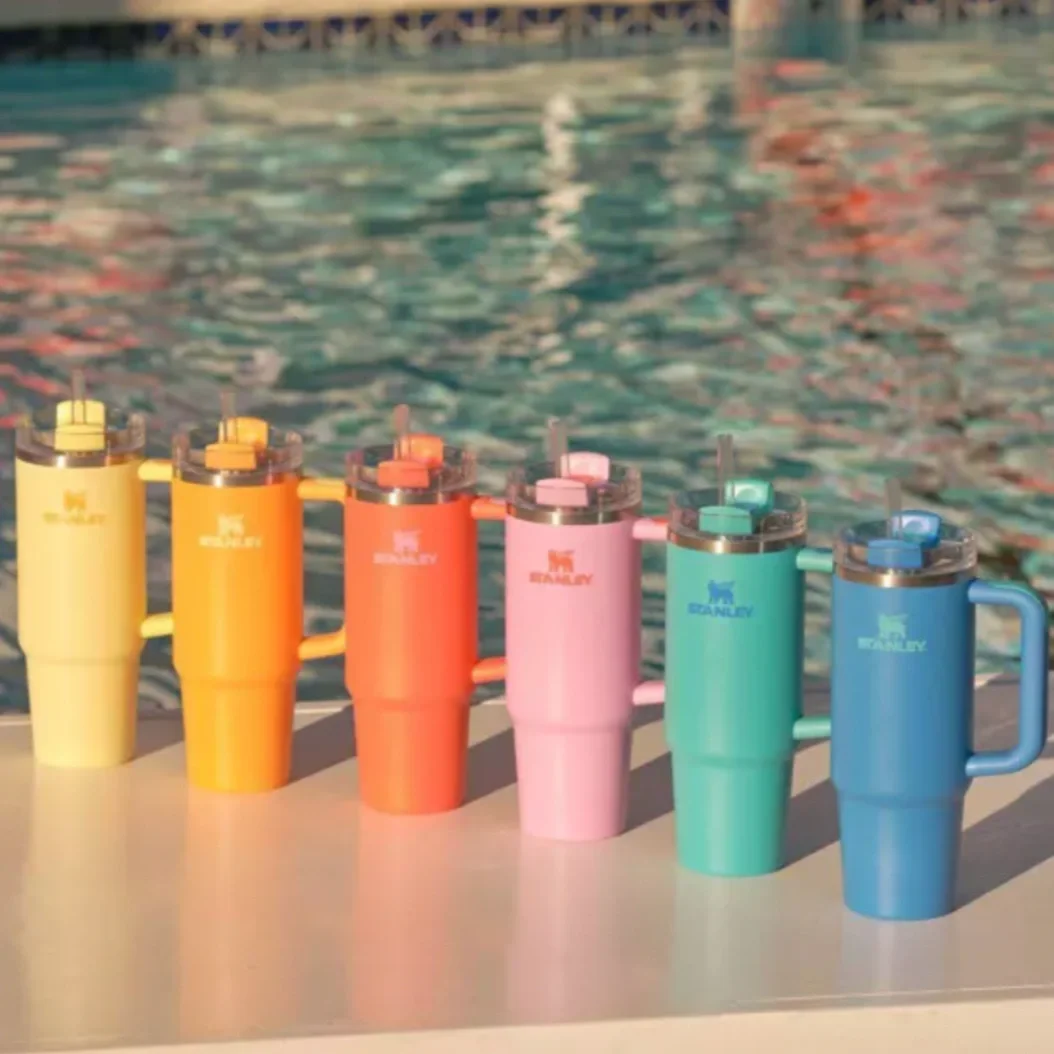
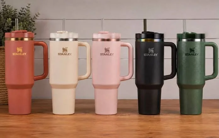
Stanley: colour turned a 100-year-old flask brand into a cultural moment
Stanley had been making rugged green thermoses for decades. The Quencher tumbler was not a new idea either. What changed was the audience and the colour palette. By leaning into soft pastels, seasonal shades and limited retailer collaborations, Stanley reached a buyer who had never shopped the camping aisle. CNBC reported the brand grew from about $73 million in annual sales in 2019 to roughly $750 million in 2023, with the Quencher at the centre of that climb.
The lesson is not "go viral". The lesson is that a new colour story can introduce an old product to a completely new buyer. It is worth noting that by 2026 the Quencher frenzy has cooled, and Stanley has been talking publicly about being more than a cup company. That is useful too: colour is a brilliant growth engine, but it works best on top of a product that is good in its own right.
Le Creuset: one signature colour, then a whole palette
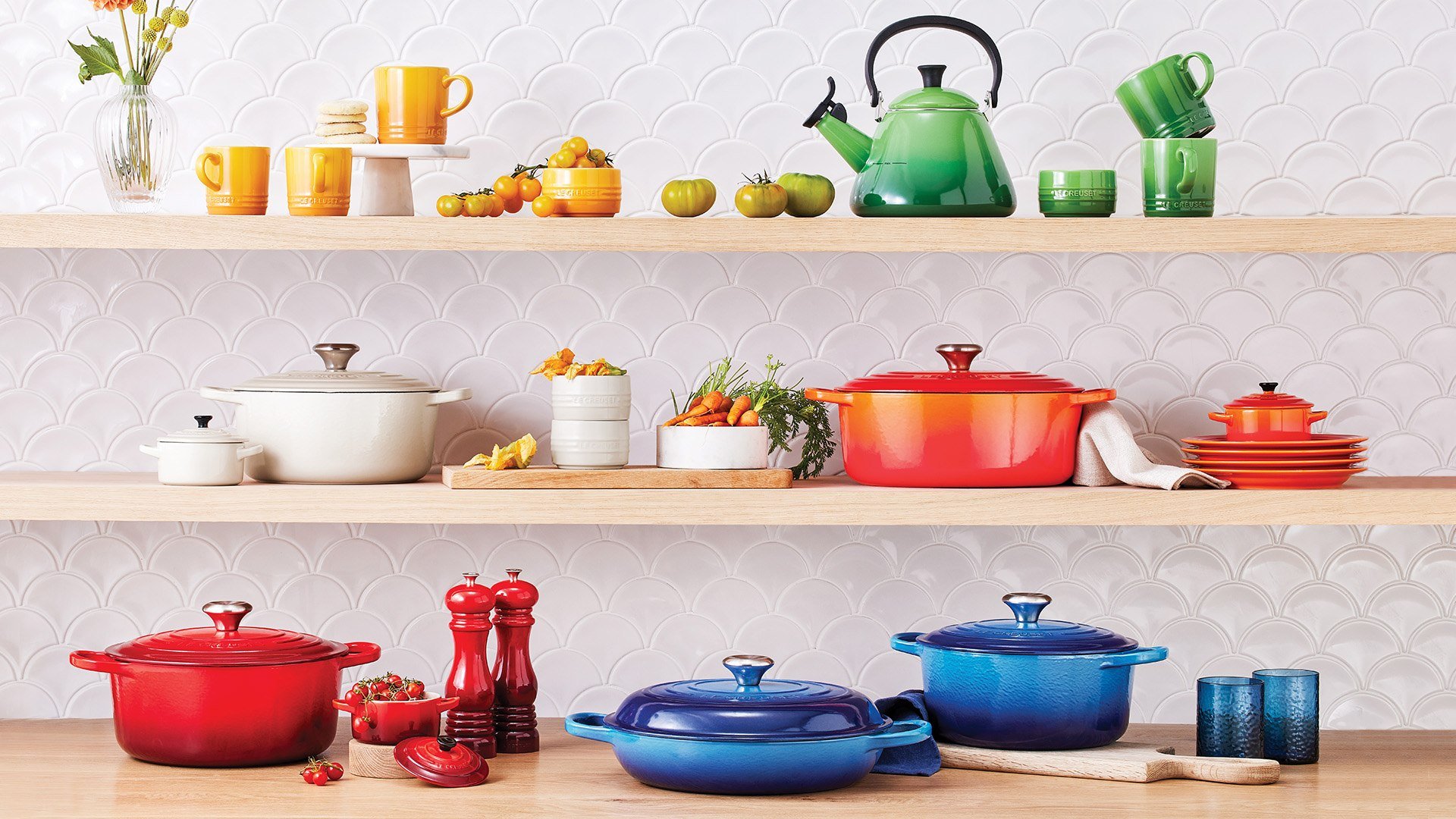
Le Creuset's original enamel finish, Volcanic (known as Flame in some markets), dates back to 1925. That single orange became so recognisable that the brand could build an entire palette around it. For its 100th anniversary in 2025 it released a gold-flecked take on the original, Flamme Dorée, and new colour launches still get covered by lifestyle media like product news.
The lesson: one hero colour builds recognition, and the palette around it builds the collection. Buyers pick "their" Le Creuset colour and then keep buying in it.
KitchenAid: a colour of the year for a mixer
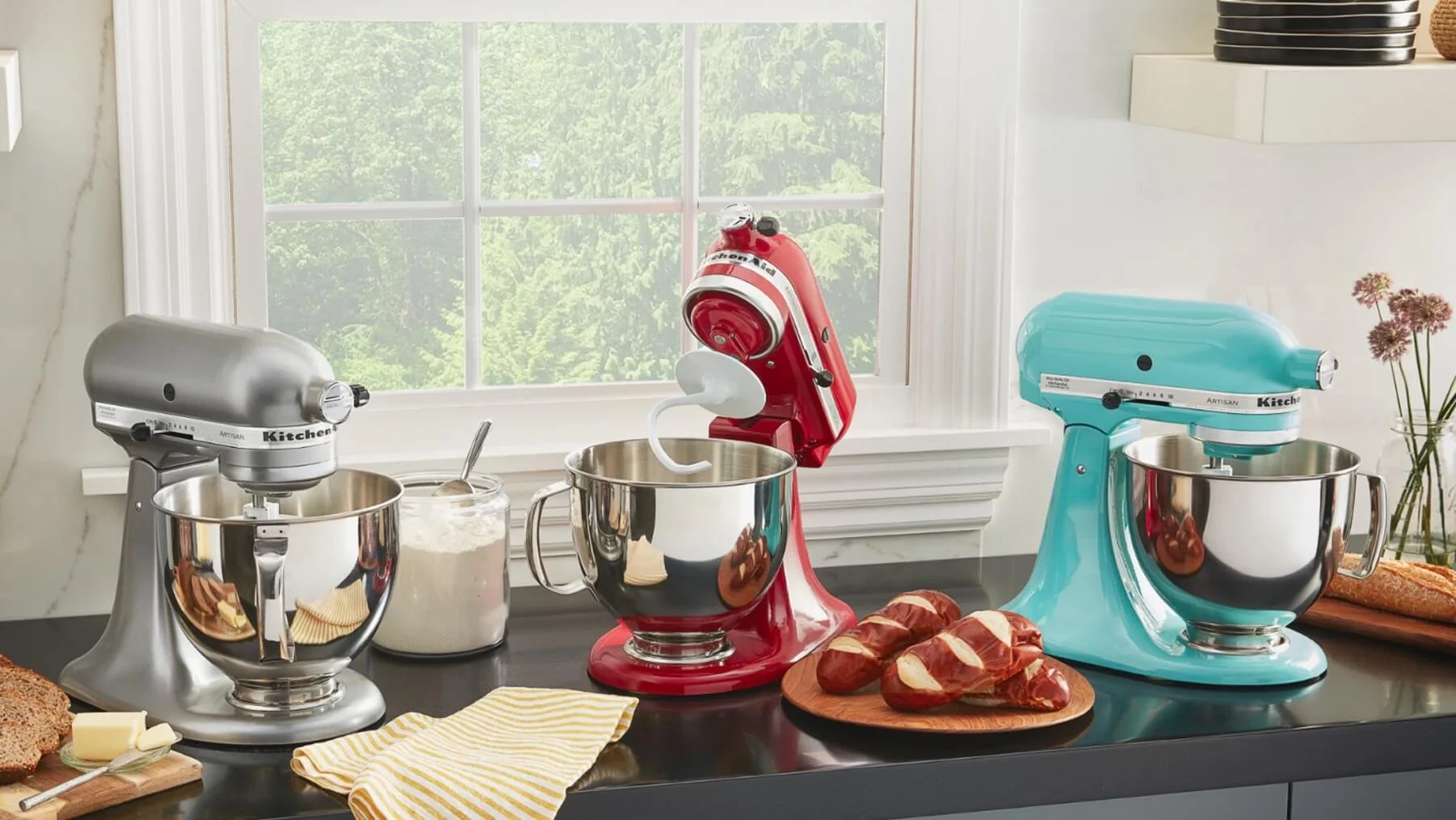
KitchenAid names an annual Color of the Year for its stand mixer. The 2026 pick is Spearmint, a soft minty green. Think about that for a second: a kitchen appliance brand gets headlines every year for releasing the same machine in a new shade. The mixer is the same. The press, the gift demand and the "I need that colour" moment are brand new.
The lesson: a scheduled colour launch creates a news cycle you can plan around.
Our Place: colour as the whole brand personality
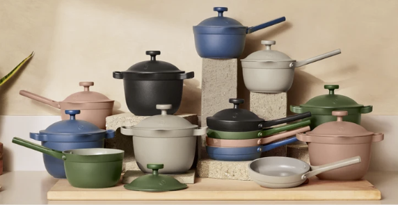
Our Place launched the Always Pan in a handful of muted, earthy colours and then kept adding shades like Blue Salt and Heat, plus limited editions that are only available for a short window. The pan's colours are a huge part of why it photographs so well and why it became a wedding registry favourite.
The lesson: a small, curated palette with occasional limited drops can make a young brand feel established fast.
Peugeot: even heritage grinders are going colourful
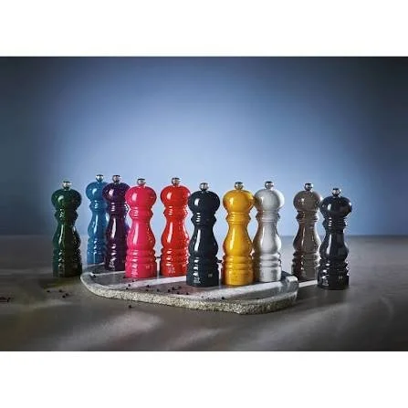
Peugeot has been making pepper mills since the 1800s and is best known for classic beechwood and chocolate finishes. Its Bistro mill set now comes in pairings like Saffron Yellow and Forest Green. When a brand that conservative starts adding colour to a salt and pepper set, it is a pretty strong signal the category is ready.
Burgon & Ball: garden tools that look good on a hook
Burgon & Ball's Sophie Conran collection sells indoor watering cans in shades like Buttermilk, Navy, Blue and Grey. These are cans for watering houseplants, and they are designed to be left out on display. That is a whole new buyer (the apartment plant parent) for a product category that used to belong in the shed.
| Brand | Core product | Colour tactic | New buyer it unlocked | What you can borrow |
|---|---|---|---|---|
| Stanley | Insulated tumbler | Seasonal pastels, retailer exclusives, limited drops | Lifestyle and social-first buyers far outside the outdoors crowd | Seasonal colour drops tied to key dates |
| Le Creuset | Enamelled cast iron | One signature hero colour plus a wide palette | Collectors and gift givers | Own one colour first, then expand |
| KitchenAid | Stand mixer | Annual Color of the Year (Spearmint for 2026) | Kitchen renovators and design-led gifters | A yearly "colour release" as a marketing moment |
| Our Place | Multi-use frying pan | Small earthy palette with limited editions | Young homeowners, registry shoppers | Curated palette that matches home decor trends |
| Peugeot | Salt and pepper mills | Two-tone contrasting sets (Saffron Yellow and Forest Green) | Style-conscious hosts and gifters | Mismatched pairs sold as a set |
| Burgon & Ball | Watering cans, garden tools | Soft designer colours on display-worthy tools | Indoor plant owners and apartment gardeners | Design the tool to live on the shelf, not in the shed |
Where sellers can try this right now
The sweet spot is a category that ticks three boxes: the product is visible in the home (it sits on a bench, a shelf or a balcony), most listings are still neutral or dated, and the unit cost is low enough that adding a colour step does not wreck your margin.
Here is how we rate a batch of home and garden categories for a colour-led range. Scores use our usual traffic light: green 8 to 10, yellow 5 to 7, red 1 to 4.
| Category | Why colour fits | Colour direction to test | New buyer persona | Colour opportunity |
|---|---|---|---|---|
| Salt and pepper mills | Sits on the bench and dining table every day; listings dominated by wood, steel and black | Contrasting pairs (butter and olive, terracotta and cream), matte pastels | The Host, The Gifter | 9 |
| Indoor watering cans | Houseplant owners leave them on display; plenty of plain plastic still out there | Powder coated metal in sage, blush, navy, mustard | The Plant Parent | 9 |
| Hand garden tools (trowel, fork, secateurs) | Coloured handles are cheap to produce and easy to spot in the garden bed | Coloured handle sets, gift boxed | The New Gardener, The Gifter | 8 |
| Kitchen storage canisters | Bench visible, sold in sets, strong "shelfie" content potential | Tonal sets, retro enamel looks | The Kitchen Renovator | 8 |
| Utensil crocks and cooking utensils | Silicone and wood-handled utensils take pigment easily; strong bundle potential | Matching utensil sets in one colourway | The First Home Buyer | 8 |
| Planters and plant pots | Already decor-led, but the colour mid-market is crowded in places | Glaze collections, two-tone dipped finishes | The Plant Parent, The Balcony Gardener | 7 |
| BBQ tool sets | Category is almost entirely stainless and black; big gifting days (Father's Day, summer) | Bold handle colours, heritage red, forest green | The Gifter, The Weekend Entertainer | 7 |
| Hose reels and hose nozzles | Visible on the side of the house; mostly green and grey plastic | Powder coated wall reels in muted designer tones | The Outdoor Stylist | 6 |
| Chopping boards | Colour already used for food safety coding; room for a "pretty" version | Composite boards in soft tones, stacked sets | The Kitchen Renovator | 6 |
| Toolboxes and household tool kits | A "home tool kit" that looks good in a hallway cupboard reaches renters and first-home buyers | Pastel and muted kits with matching case | The First Home Buyer, The Renter | 6 |
| Drink bottles and tumblers | Proven demand, but the colour game is saturated and dominated by big brands | Only with a real niche (kids, trades, a specific sport) | Niche communities | 4 |
Spotlight: salt and pepper mills
This is our favourite example because it shows the whole idea in one product.
Walk through the top listings for salt and pepper grinders on any major marketplace and you will mostly see brushed stainless steel, acrylic, black matte and natural wood. The mechanism is the thing sellers compete on (ceramic versus steel burrs, adjustable coarseness, gravity versus manual). That is useful, but it means almost everyone is fighting on specs.
Now picture a listing for a matte butter yellow salt mill paired with a deep olive pepper mill, sold as a "Host Set" in a gift box. Same ceramic mechanism. Same factory. A completely different buyer: the person setting a table for friends, the person looking for a housewarming gift under $50, the person who just finished a kitchen reno and wants the bench to look finished.
A few tips for this category specifically:
- Sell pairs, not singles. Two contrasting colours in a set is the easiest upsell in the category, and it is exactly what heritage brands like Peugeot are now doing.
- Colour code the job. Light colour for salt, darker colour for pepper is a genuinely useful feature, not just a look. Say so in the listing.
- Keep the mechanism boring and good. Colour gets the click, but reviews still come down to whether it grinds well and does not jam. Do not cut corners on the burr to pay for the paint.
Spotlight: garden tools and watering cans
Garden tools have traditionally been bought by experienced gardeners who care about steel and grip. That buyer is still there. But there is a much bigger, faster growing group who garden on a balcony, keep twenty houseplants in a flat, or are just getting started in their first backyard. They do not want a tool that looks like it came from a hardware store. They want one that looks nice on a hook by the back door.
Coloured handles, powder coated watering cans and gift boxed "starter kits" are an easy entry here. Tools also have a practical colour benefit: a bright handle is much easier to find in a garden bed than a green one.
The new buyer personas colour brings in
Colour does not just make existing buyers happier. It brings in people who were never shopping your category in the first place. These are the personas worth writing your listings for.
| Persona | Who they are | What they care about | How to reach them |
|---|---|---|---|
| The Gifter | Buying for a housewarming, birthday, wedding or holiday | Looks special, arrives ready to give, feels premium for the price | Gift boxes, "gift for" keywords, seasonal ads |
| The Kitchen Renovator | Just updated their kitchen or is planning to | Matching finishes, a cohesive look on the bench | Lifestyle photography, colour-matched collections |
| The Plant Parent | Urban, lots of indoor plants, little outdoor space | Tools that double as decor, compact sizes | TikTok and Instagram plant content, Etsy style keywords |
| The First Home Buyer | Setting up a home from scratch | Buying lots at once, wants things to match, value conscious | Bundles, starter kits, "everything you need" listings |
| The Host | Loves having people over and setting a nice table | Statement pieces, conversation starters | Tablescape imagery, entertaining season timing |
| The Collector | Bought one colour and wants the next | New releases, limited runs, completing a set | Email and newsletter drops, "new colour" announcements |
| The Outdoor Stylist | Treats the balcony or backyard as another room | Coordinated outdoor look, weather-resistant finishes | Spring and summer campaigns, outdoor living keywords |
How to pick your colours without guessing
You do not need a design team. You need a bit of research and the discipline to start small.
Watch the colour forecasters, but do not copy them blindly. Pantone's 2026 Color of the Year is Cloud Dancer, a soft white, which is a big hint that clean, calm neutrals are having a moment. KitchenAid went with Spearmint. Put those two together and you get a very usable direction: soft, fresh, light tones that sit well in a modern kitchen or garden. Use forecasts as a compass, not a map.
Look at what is selling in adjacent categories. If sage green is everywhere in bedding, tiles and cabinetry, buyers will want accessories that match. Home decor trends usually lead accessories by a season or two.
Check your own category for gaps. Search your product on Amazon, eBay, Etsy and TikTok Shop and literally count the colours on page one. If 80% of listings are black and silver, you have found your opening.
Name your colours. "Green" is a spec. "Olive Grove" is a story. Named colours are more searchable, more giftable and far more memorable. Every big brand in this article does it.
A simple colour launch playbook
| Step | What to do | Why it matters |
|---|---|---|
| 1. Pick a proven product | Start with something that already sells and already gets good reviews | Colour amplifies a good product. It cannot rescue a bad one. |
| 2. Launch three to five colours | One safe neutral, one or two trend shades, one bold "hero" colour | Enough choice to feel like a range, not so many that stock gets stuck |
| 3. Talk to your supplier about colour MOQs | Ask for per-colour MOQs, Pantone matching options and physical colour samples before you commit | Colour minimums and matching costs vary a lot by material and factory |
| 4. Shoot lifestyle images | Show every colour in a real kitchen, table or garden setting | Colour sells in context. Buyers need to picture it in their space. |
| 5. Build bundles | Matching sets, contrasting pairs and "starter kits" | Lifts order value and gives gifters an easy choice |
| 6. Let data pick the next run | Track sell-through by colour for 60 to 90 days, then reorder winners and retire the rest | Buyers tell you what they want faster than any forecast |
| 7. Plan a seasonal or limited colour | Once the core range is working, add one limited colour tied to a season or holiday | Creates urgency and gives you a reason to email your customers |
The watch-outs (keep these in your back pocket)
We are big fans of this strategy, but go in with eyes open.
- SKU sprawl is real. Every colour is another inventory line to forecast. Start with a tight palette and grow it only when the numbers back you up.
- Colour consistency matters. A "sage" that arrives looking grey will earn you returns and bad reviews. Always approve a physical sample from the production batch, not just a photo.
- Finishes need to hold up. Coatings on kitchen and outdoor products have to survive washing, UV, heat and handling. Ask your supplier about the coating type, food contact suitability for anything that touches food, and fade resistance for outdoor items.
- Trends fade. Stanley's own story shows how quickly a colour craze can cool. Keep a couple of evergreen colours in the range so you are never fully dependent on one trend.
- Landed costs can move. If you are sourcing from overseas, tariffs and freight still swing around, so rerun your margin maths per colour before you place the order and check anything unusual with a customs broker.
The bottom line
Colour is one of the few growth levers where the product, the factory and the mechanism can all stay the same while the audience gets bigger. Stanley did it with a tumbler. Le Creuset did it with a pot. KitchenAid does it every year with a mixer. There is no reason it cannot work for your pepper grinder, your watering can or your trowel.
Most of these categories are still sitting in a sea of black and silver, waiting for someone to show up with a butter yellow option and a good story. That someone might as well be you.
Pick one product. Pick three colours. Give them great names. Then let your buyers tell you which one wins.
Sources:CNBC: How a 40-ounce cup turned Stanley into a $750 million a year business · Fast Company: What's next for Stanley after the water bottle craze · Le Creuset: The Legend of Flame · Food Network: Le Creuset 100th anniversary Flamme Dorée · Taste of Home: KitchenAid 2026 Color of the Year · Pantone Color of the Year 2026: Cloud Dancer · The Kitchn: Our Place Blue Salt launch · Peugeot Bistro Salt and Pepper Mill Set · Burgon & Ball Sophie Conran Collection