Overview Boxes
Overview boxes summarise the data set. The definitions of each metric are:
Listings: A count of the listings within the data set.
Avg #Sold/Week: The average number of products sold per week per listing.
Avg $Sold/Week: The average sales value achieved each week per listing.
Total #Sold/Week: The total number of items sold each week for the listings in the data set.
Total $Sold/Week: The total value of items sold each week for the listings in the data set.
Data Tables
Data is presented in an easy to use tabular format with 3 distinct data view options:
Seller view
Brand view, and
Listings view.
Click the headers of the data table to sort. Here are the definitions for the data column as seen in the Seller view:
Listings: count of listings for that seller.
Qty: Quantity of stock available at the time that the report is run.
Sold: Total quantity sold by the listings included in the data set.
#sold/wk: Average quantity sold per week over the duration of the listing.
Med Price: The median price. After sorting the sold prices in order, the median price is the number in the middle of the list (or an average of the two middle numbers if the dataset is even).
$sold/wk: Average sales value sold per week over the duration of the listing.
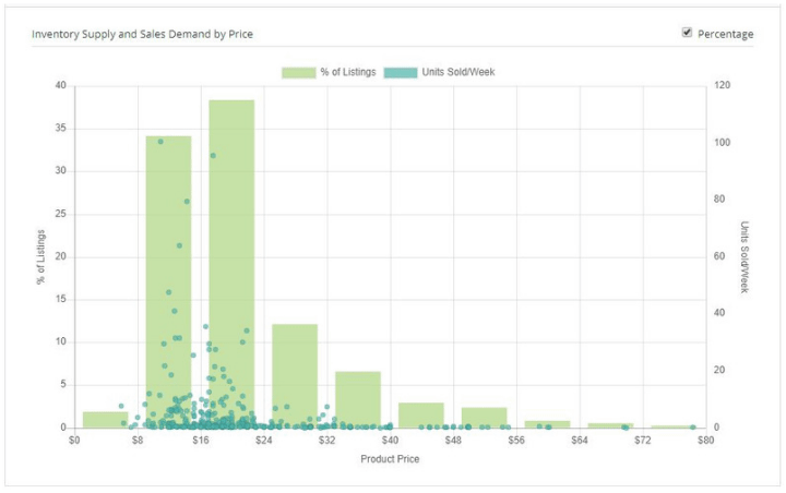
Charts
Charts visually summarise the data set, including any filters that have been applied. To see the Supply Demand graph, click the chart icon located at the top right of the data table.
The Supply Demand graph uses a bar chart to show the percent of listings in each price bracket. It uses a scatter plot (dots) to show the individual listing’s average weekly sales volume.
If you hover over a bar or dot, notations of metrics will appear.
Clicking on a dot will open a new tab for that eBay listing.
If you cannot see the whole graph on your screen, click the Hide Header button in the right frame. It looks like the 4-corners of a square.