
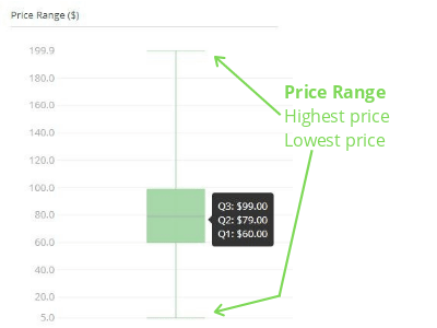
The postage and price ranges are presented using box plots. This type of graph can show that although a price range may be very wide, the price of most listings may be concentrated in a much narrower band.
The vertical axis of the box plot presents the highest and lowest prices within the range. The horizontal line is the median price (Q2) within the range.
The green box above the horizontal line represents 25% of listings above the median price. The green box below the horizontal line represents 25% of listings below the median price.
As the graph splits the number of listings into 25% segments, it makes it quick to see exactly where 25%, 50% to 75% of all listings are priced against the 100%.